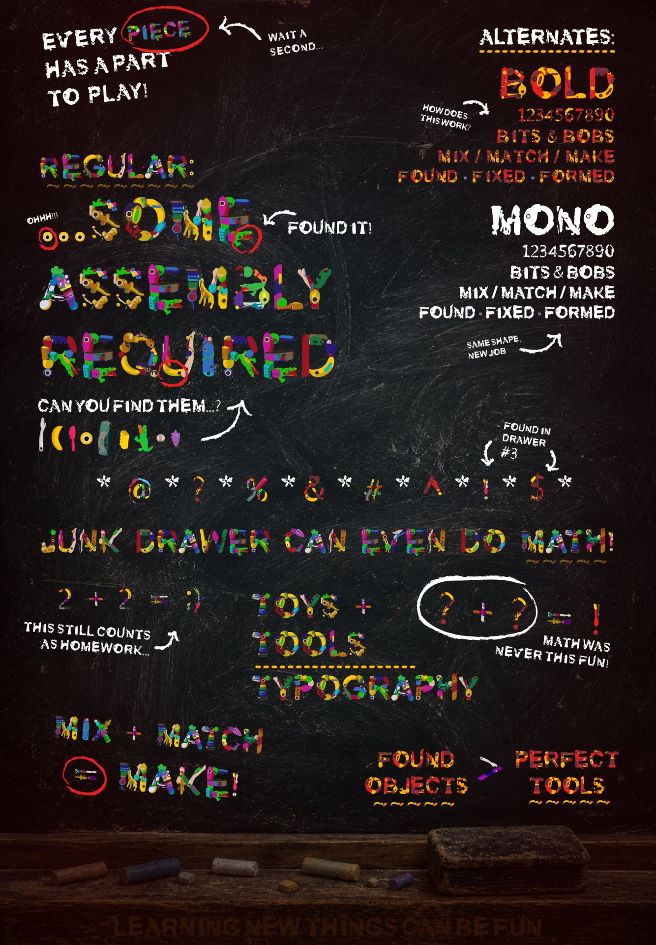
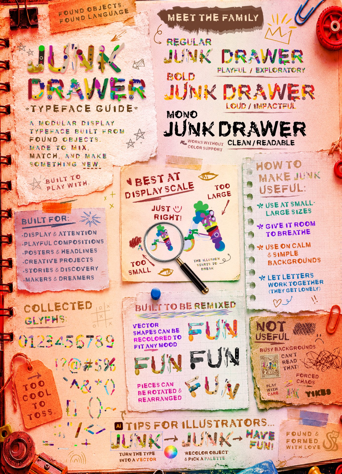
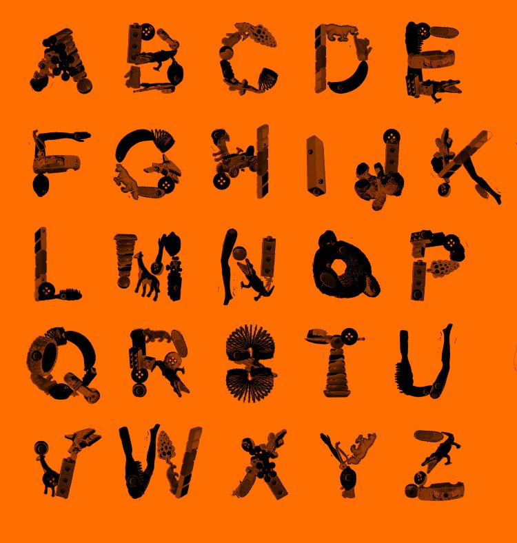
Regular
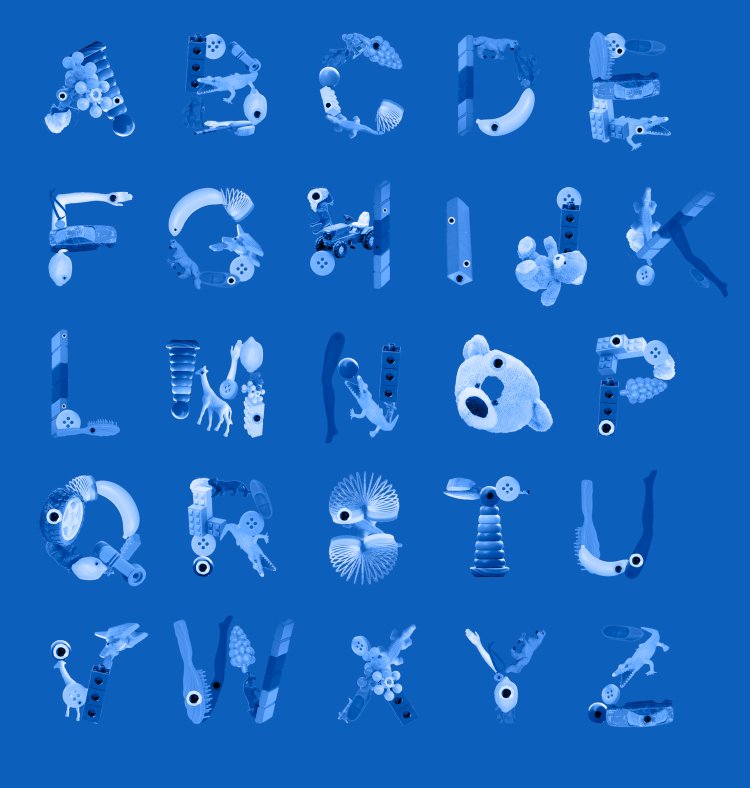
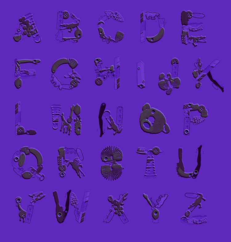
Playful / Exploratory
Full-color OpenType font built for display typography, branding, and visual storytelling..


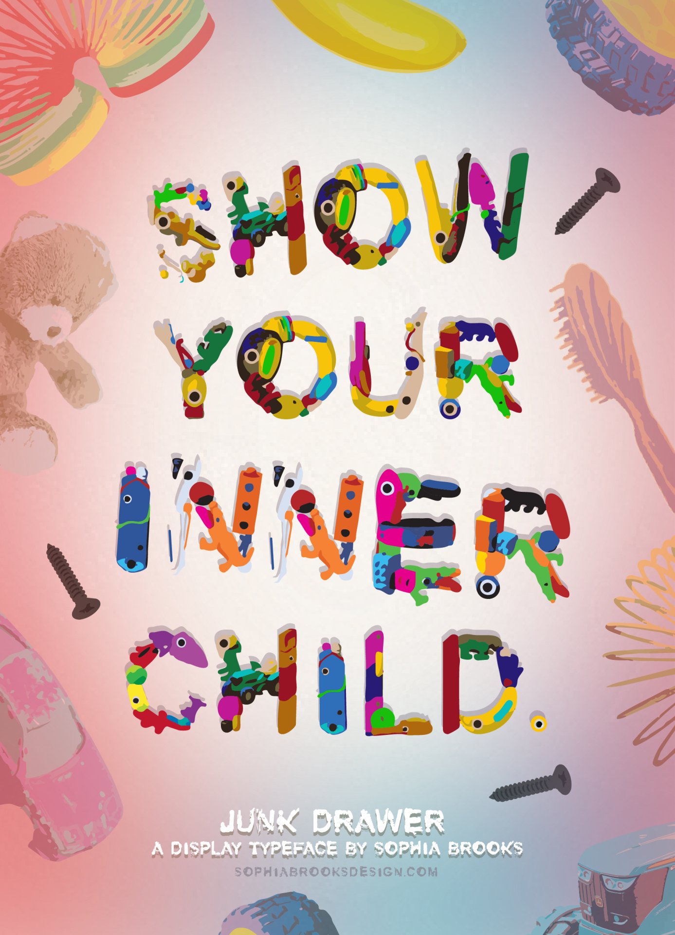


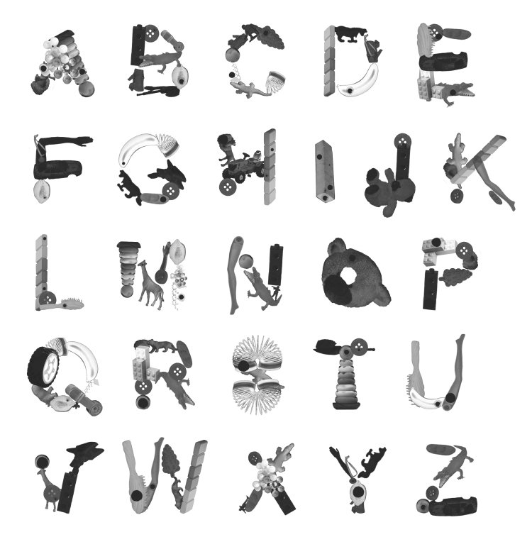
Three styles. One collection of found objects.
Playful / Exploratory
Full-color OpenType font built for display typography, branding, and visual storytelling..
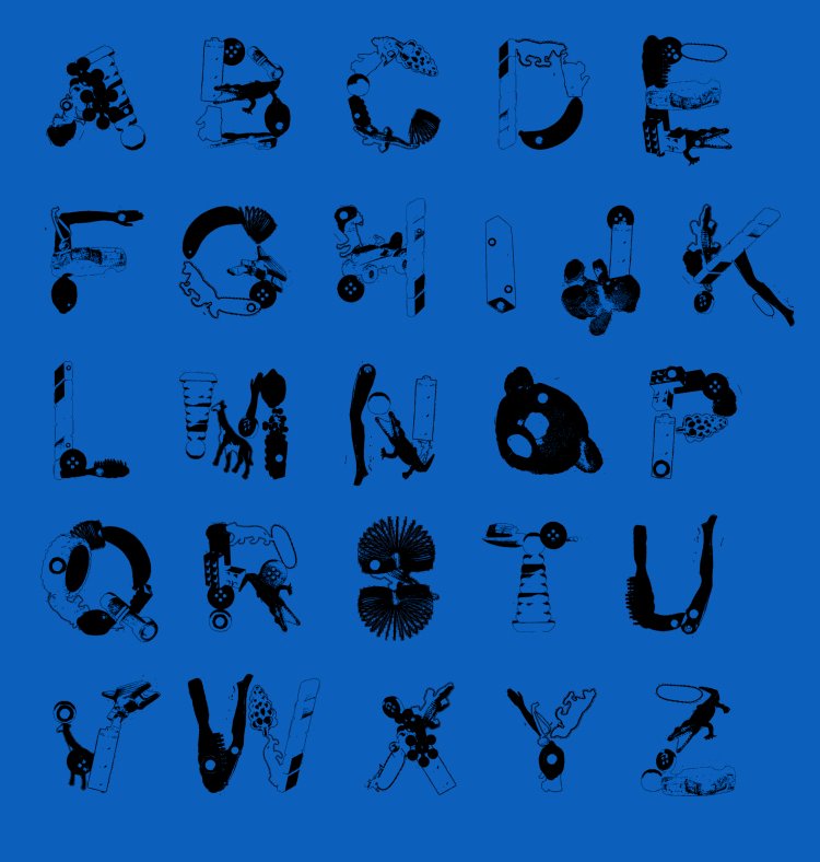
Loud / Impactful
Streamlined color style optimized for headlines, posters, & large-scale applications.

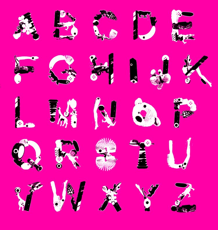
Clean / Readable
Single-color companion style with broad software support & easy recoloring.

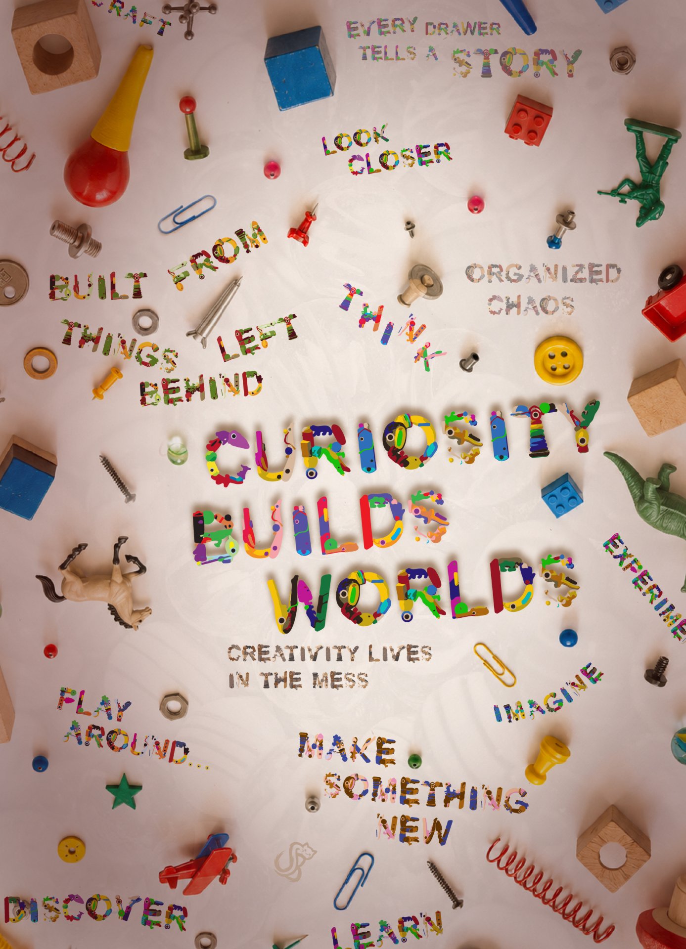
Same pieces. Different possibilities.
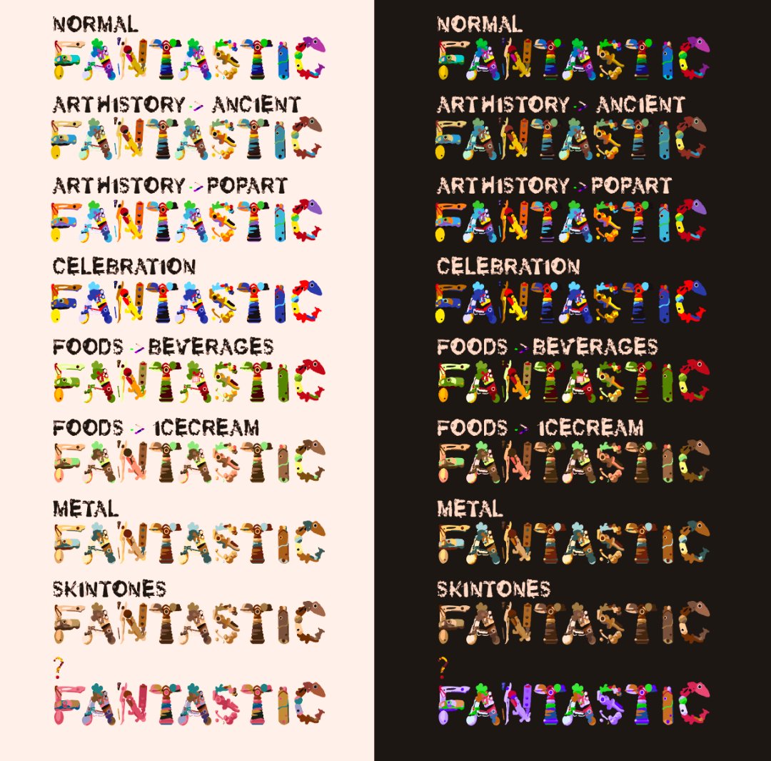
Junk Drawer can shift personalities through color palettes, style variants, and composition choices. The same collection of found objects can feel playful, adventurous, nostalgic, energetic, or refined depending on how it is remixed.

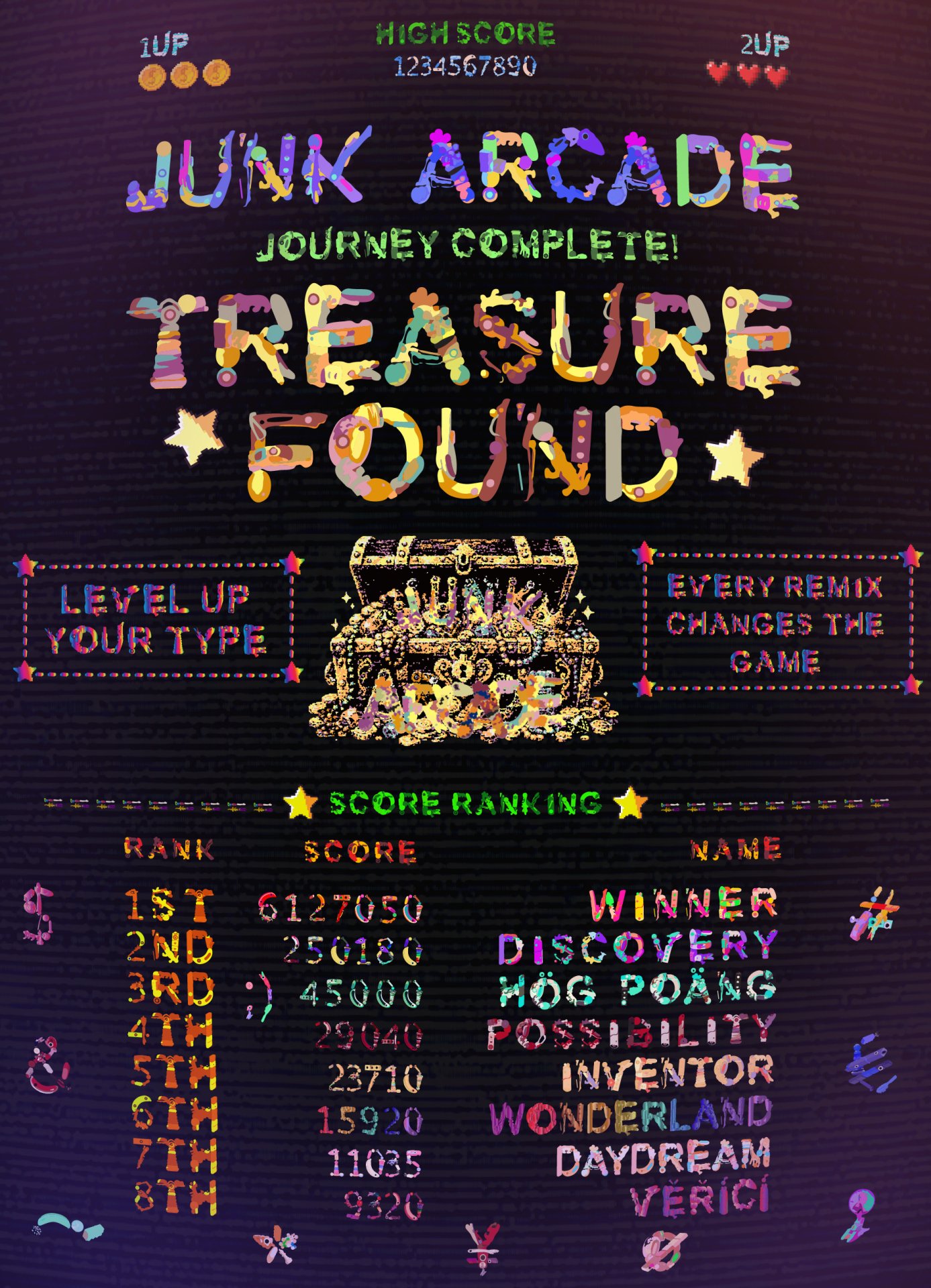
PLAY
Try a word, switch the style, and remix the mood to see how the same found-object letterforms can take on entirely different personalities, stories, and visual moods.
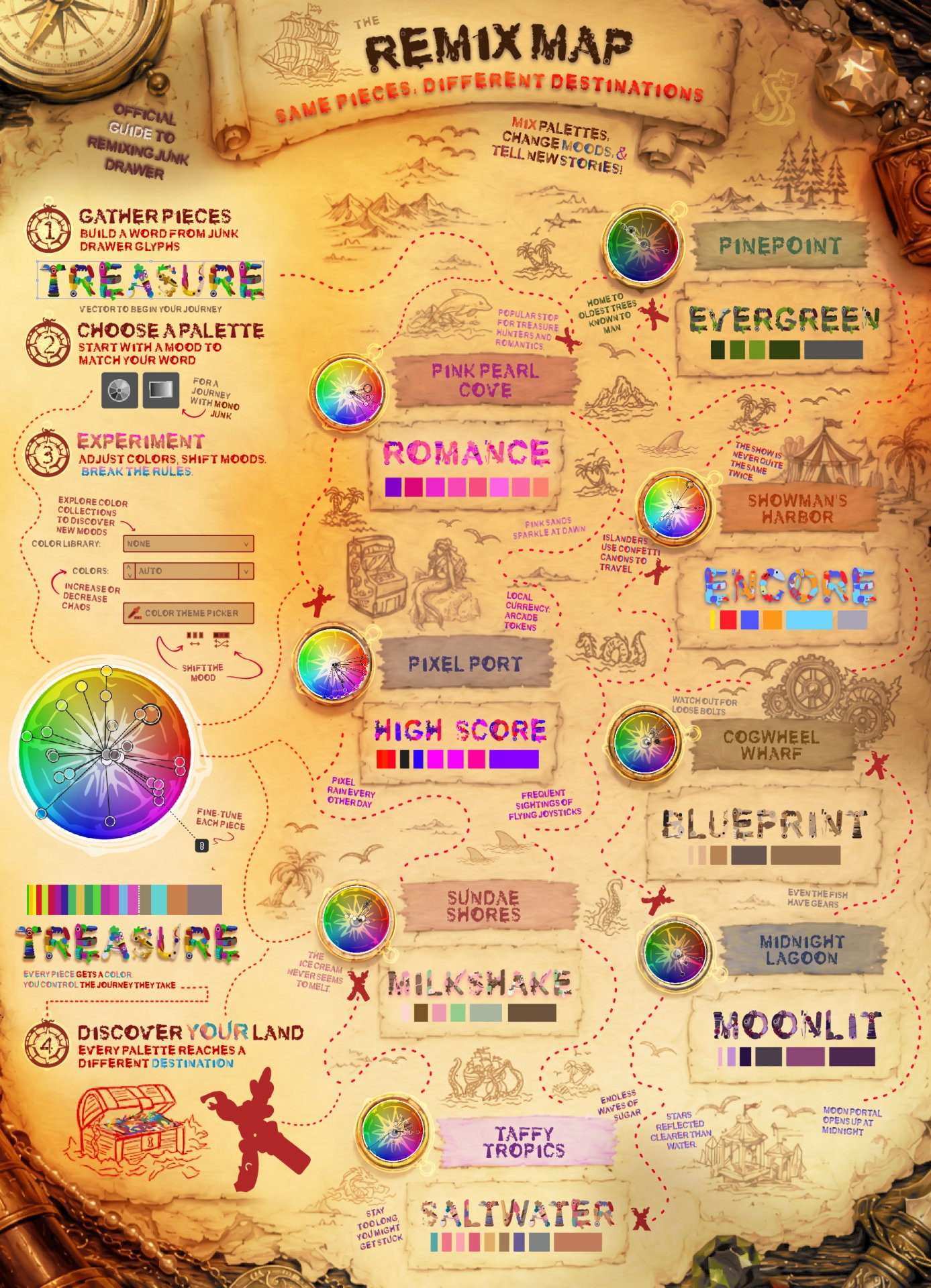
Every drawer tells a different story.
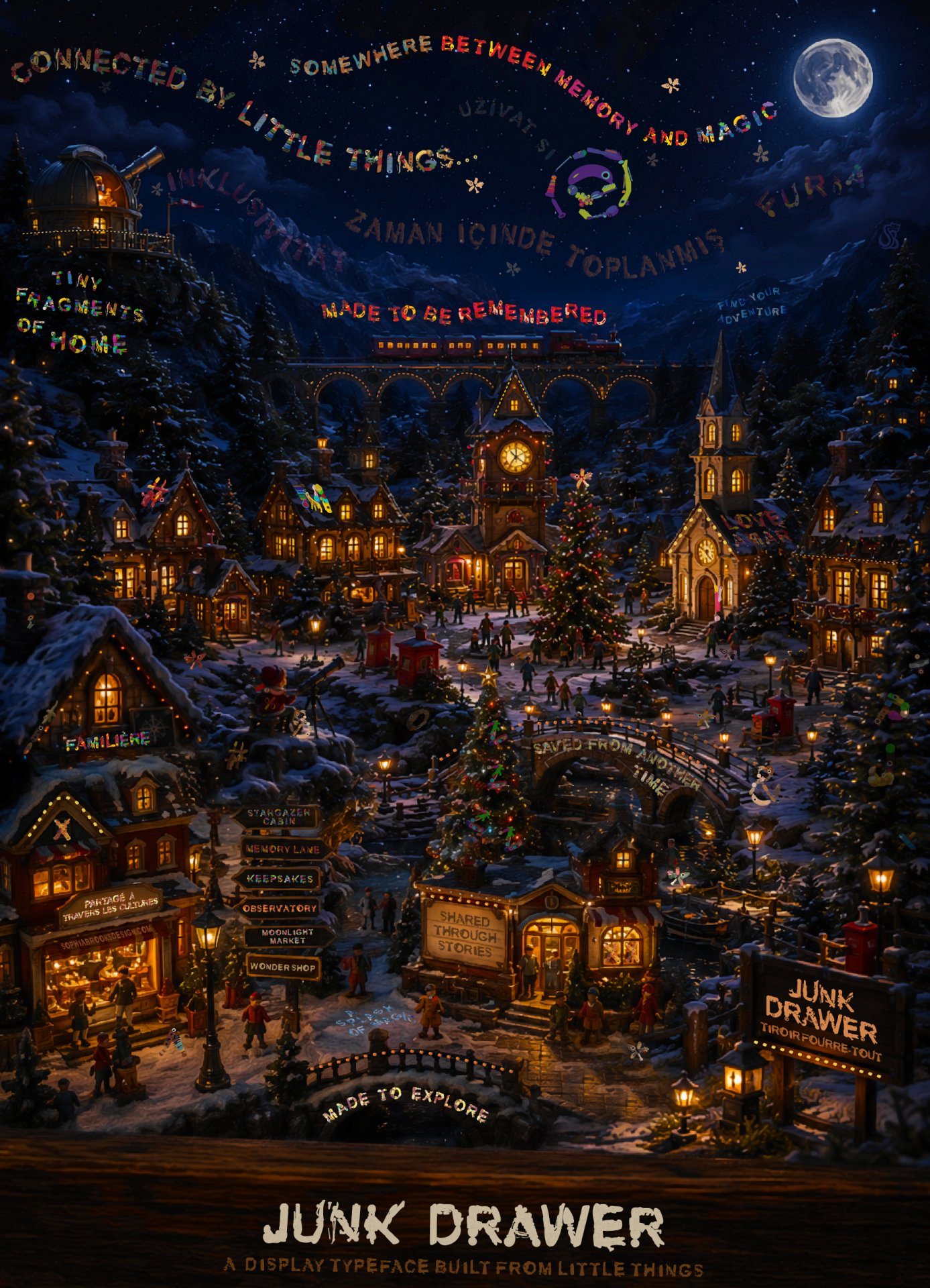
Download the complete Junk Drawer typeface family and start building with toys, trinkets, and little treasures of your own.
Included in the download are Regular, Bold, and Mono styles, a full type specimen PDF, extended Latin character support, and usage information to help you explore the system.
Junk Drawer includes color OpenType fonts. Support varies by software and operating system. For best results, use modern creative applications that support OpenType color fonts. Mono is included as a reliable single-color option for broader compatibility.
The next story in the drawer might be yours.
A closer look at the inspirations, experiments, and discoveries that shaped junk drawer.
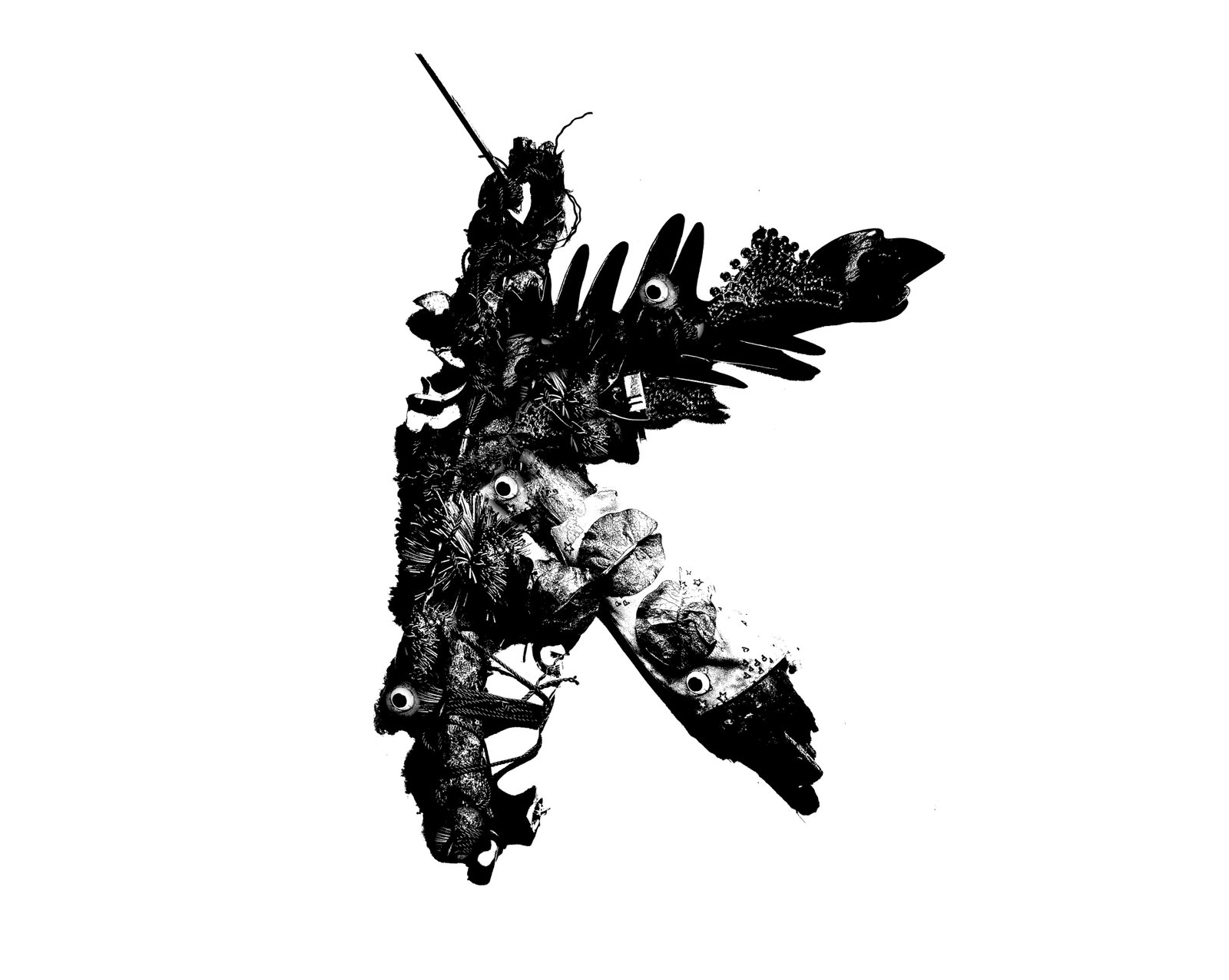
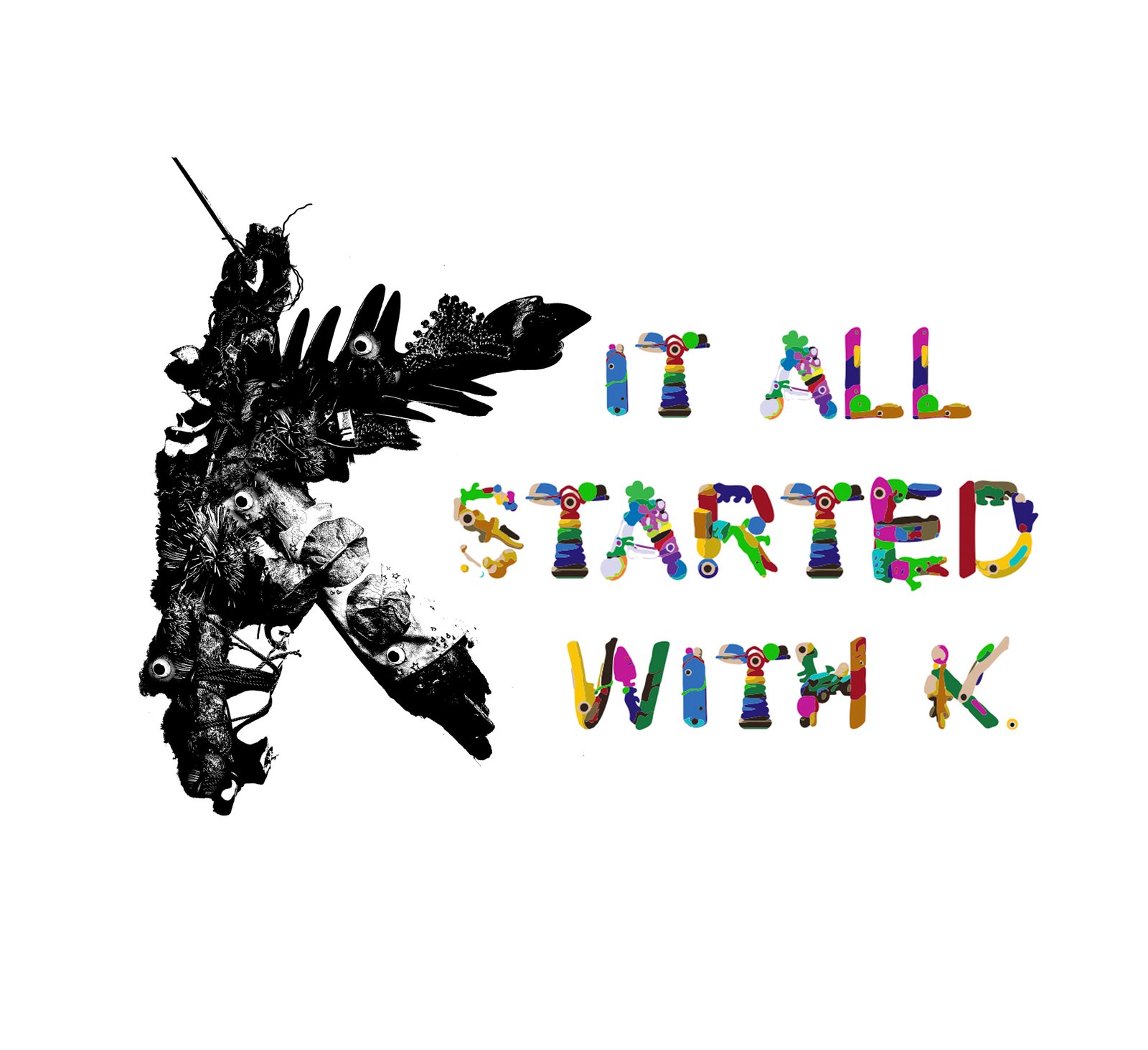
Junk Drawer began during a typography course while I was pursuing my graphic
design degree. One classroom exercise challenged students to build letterforms
from unconventional objects before moving on to their own type design projects.
While scavenging for materials and constructing the letter K out of physical
objects, I became fascinated by the relationship between everyday items and
written language.
Typography helps us understand the world around us, yet it is so deeply embedded
into our daily lives that we often stop noticing it altogether. We learn to read
and write at an early age, and over time letters become second nature—symbols we
instinctively recognize without ever questioning why.
The assignment encouraged me to look at typography differently. How can a
collection of unrelated objects suddenly become a recognizable letter? Why are
we able to identify meaning in shapes that were never intended to be language?
How much can a letter change before it stops being readable? The exercise
transformed typography from something I used into something I began actively
examining.
Long after the assignment ended, those questions stayed with me. Eventually,
they led to a new one:
What happens when the forgotten things in a junk drawer become the language we
use to tell stories?
Early versions of Junk Drawer leaned heavily into a rougher, more chaotic style. The letterforms felt assembled, imperfect, and handmade. While many of these experiments never made it into the final family, they helped establish the playful spirit and found-object philosophy that would define the project.
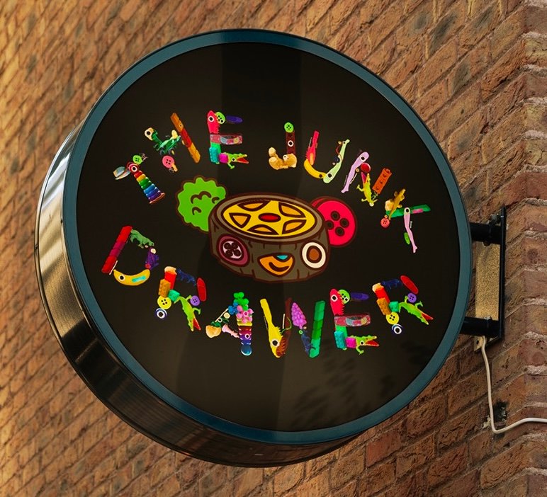
Before becoming a standalone typeface, Junk Drawer was closely tied to a larger creative reuse project called The Junk Drawer. The typeface inherited many of the same ideas: curiosity, experimentation, collecting forgotten things, and transforming them into something new.
After Junk Drawer became a functioning typeface, I considered the project largely
complete. The letterforms had been simplified into vectors, the family was
working, and the original color palette felt established.
Then, while experimenting with Illustrator's recolor tools, I started testing
alternate palettes out of curiosity. What began as a simple color exercise
quickly revealed something unexpected: the
typeface wasn't tied to a single identity at all.
The same collection of objects could feel playful, adventurous, nostalgic,
energetic, mysterious, or refined depending on how it was remixed. Suddenly,
Junk Drawer felt less like a finished font and more like a system of
possibilities.
The drawer was much bigger than I thought, and every remix felt like discovering
a new story inside the same collection of objects. At that point, keeping it to
myself no longer felt like the right ending.
What started as a classroom typography exercise eventually grew into a complete
type family, poster series, motion piece, interactive website, and ongoing
creative playground.
Along the way, the project became less about the objects themselves and more
about the ideas hidden inside them: curiosity, discovery, experimentation, and
finding value in things that might otherwise be overlooked.
Every new variation began with the same pieces. The only thing that changed was
the imagination to see something more.